Brand Identity | Website
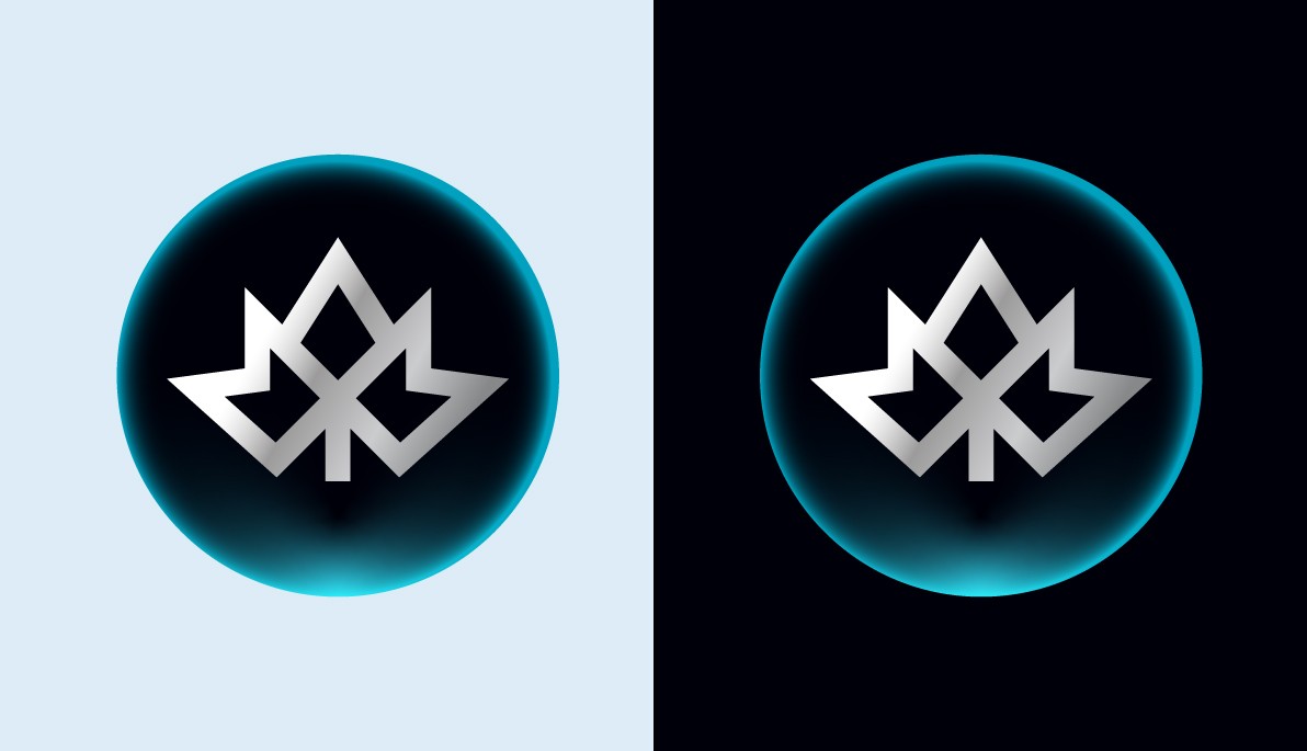
The Identity was designed as a modern interpretation of the maple leaf, unmistakably Canadian yet freed from familiar symbolism. The focus was on optical balance rather than rigid geometry, resulting in a unique form that expresses trust, structure, and transparency, the core pillars of QCAD.
Year
2024
I led the visual identity and digital presence for QCAD, the Canadian dollar stablecoin developed by Stablecorp.
The icon was custom designed as a modern interpretation of the maple leaf, unmistakably Canadian yet freed from familiar symbolism. The focus was on optical balance rather than rigid geometry, resulting in a unique form that expresses trust, structure, and transparency, the core pillars of QCAD.
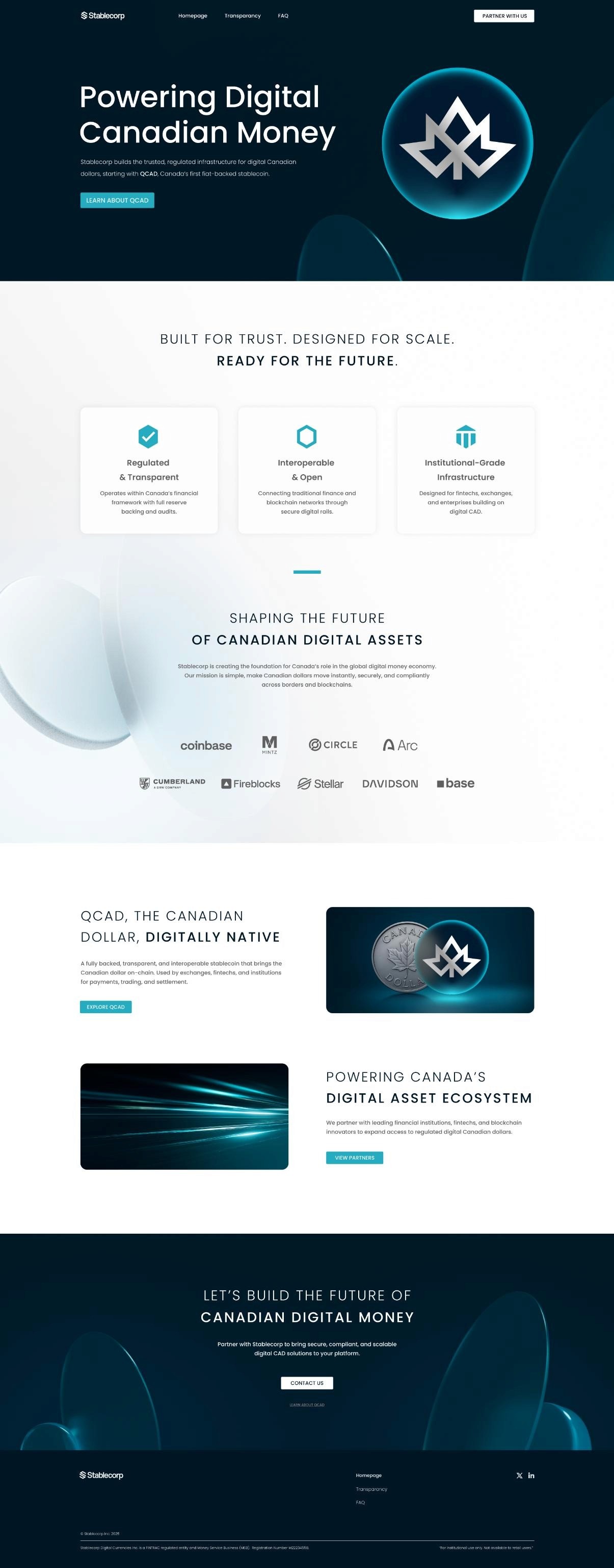
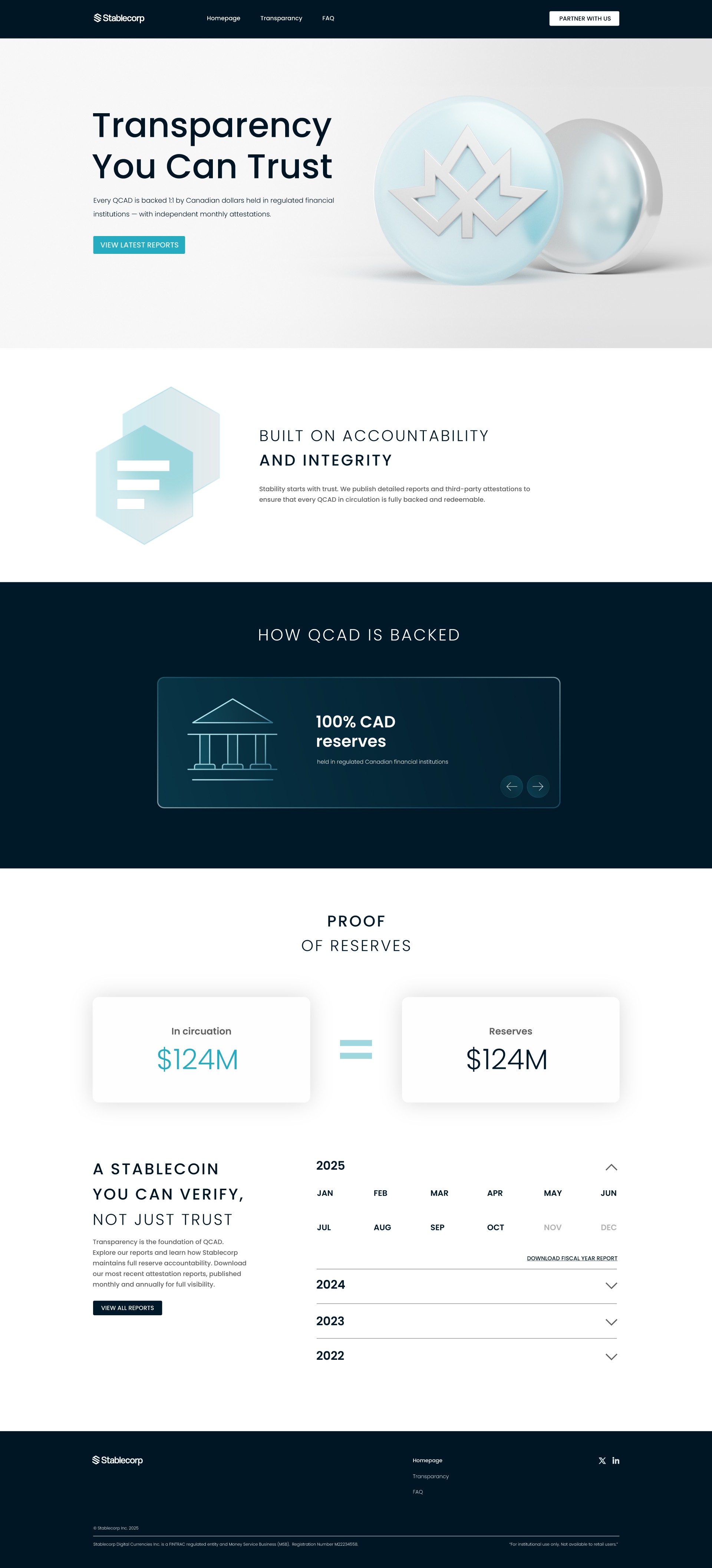
Beyond the mark, I designed the layout and visual system of the official QCAD website, crafting every interface element, icon, and visual detail to ensure cohesion and clarity. All assets were developed in harmony with Stablecorp’s broader brand language, creating a refined, credible, and forward-looking presence that reflects the seriousness and stability required of a national digital currency.